- Homemain page
- Class Exercisesin lecture
- Assignments1,2,3,4,5
- Researchand findings
- Final Projecthorray
- Galleryview mj's works
Monday, April 12, 2010
Reflection
a. In view that everyone can have their very own designing style, we had taken much time to adjust the colors and frames to make it coherent throughout the book.
b. Our team decided to use Adobe Illustrator due to the need for large number of vector drawings involved. While we often use Adobe Indesign for the designing of publications, this is the first time we use Adobe Illustrator for the design of a book.
Hence, we do not exactly know the requirements or guides required in our story frames for the printer. Our team had to check the different requirements from various printers and worked accordingly.
c. In the search for printers for our storybook, we realized that a good number of printers do not work on hard-cover or perfect binding. Some indicated that the number of pages for the storybook is too insignificant for perfect binding.
d. Our first printing effort was not successful. The printer failed to cut the paper along our specified guides. Hence, there are pages showing incomplete frames or come with white spaces at the bottom of the page. Fortunately, we had sent the book for printing early, thus allowing us to print another book on time for submission.
However, due to the time constraint, the second book comes without a hard cover, which would otherwise requires longer printing time.
Lesson Gained
a. We learnt the importance of time planning and having contingency plan. Fortunately, we had planned for time to allow checking and possible re-print in case of any misprint.
Hence, we were able to find time to work on our second printing after the first attempt which we were not satisfied with.
b. We learnt that when working as a team for design process, it is important for all members to be well-informed of the concept and design decisions in order to ensure the coherence of the storybook.
c. We also now appreciate that the production a storybook takes more than a storyline and a series of illustrations – it requires the synergy of both. Layout, framing, text organization, colors are all part of considerations in order to effectively deliver the story and its message
Problem in production
While we went for a second printing attempt, we also considered that hard cover printing will take more time than what we could afford to. Thus we resorted to printing the book at a different printing shop with soft cover in view of the time constraint. However, this is compensated with a quality heavy paper for the cover.
This is a lesson learnt though :)
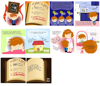
Storybook Organization Exploration
For instance, instead of putting the following two scenes as two separate frames, we link them through certain similarity eg. the environment.
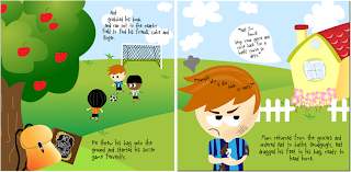
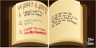
In another example, our book takes the form of the magical book in some pages
Storybook Color Exploration
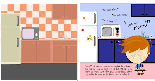
The sense of depth created also helps to bring forth the foreground and background relation, and aids in directing reader’s focus and flow of view.
Sunday, April 11, 2010
Assignment 3 - New work, Final Submission
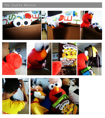
Assignment 3 - Angle and Shot Exploration Part 1
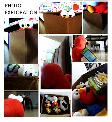
Tried various angles, perspectives and composition along the way in order to find the mood and feel that I wanted to portray.
While I have my storboard as my guide, I also tried other possible ways to present the actions and emotions by the Cookie Monster. For instance, to show him climbing out, i tried shooting him top-down which emphasizes the height and tried shooting bottom-up to highlight his action of climbing out instead.
As the toy is really stiff, I had tried various positions as well to suggest movements. Just for the scene showing him peeking out of the box, I took as many as 20 photos before deciding on which was more effective in conveying the emotion and the story.
Saturday, April 10, 2010
Assignment 3 - Storyboard
Did a fast sketch of the storyboard before shooting. Helped me to pen down some general angles/composition which i have in mind.
Friday, April 9, 2010
Final Project - Exploration
FInal Project - Storyboard
Assignment 5 - Refined for Submission
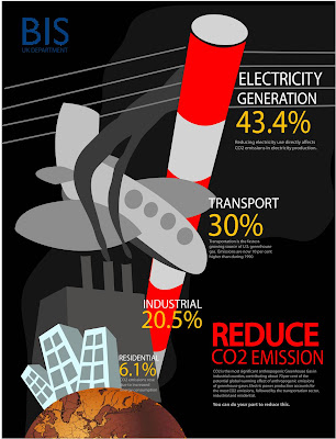
Assignment 4 - Refined for Submission
Assignment 2 - Refined before Submission
Assignment 1 - Refined for Submission
Saturday, March 20, 2010
Final Project - Main Character Development
Thursday, March 11, 2010
Assignment 5 - Infographic
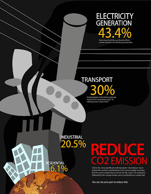
Tata! My first submission for the assignment after much research and multiple attempts. It shows the amount of CO2 emission from different sectors in US and the smaller text shows more detail on the statistic and what the people can do to help.
Tried a few designs which I just feel dissatisfied with. Hence, adjusted along the way before getting this
Following refinement to be done:
- It looks like a plane crash on first sight. So I gonna change the color of the smoke perhaps.
- With feedback from last tutorial, I shall make the smaller-to-larger perspective more significant.
- Gonna change the design for electric pole as it is not easily recognisable.
Saturday, March 6, 2010
Assignment 5 - Infographic Research
I was really fascinated by this infographic while doing my research. Even though there is abundant (even excessive) information clumped into one, I like how the reader is able to "read" the danger and graveness of the information presented through the "skull"
Wednesday, March 3, 2010
Friday, February 26, 2010
Assignment 4 - Color Coliation Exploration
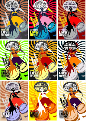
Was having fun exploring colors and finding colors to suit the mood and theme I would like to bring across :))
Tuesday, February 23, 2010
Class Exercise E
• Pick 2 words from the list
meaning of these words (1 image per word)
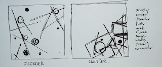
Clutter: Made it heavy and squeezy on one corner to bring across the feel of being cluttered. The overlapping of shapes and lines helps to reinforce the idea of clutter.
Thursday, February 11, 2010
Assignment 2 - Less is More
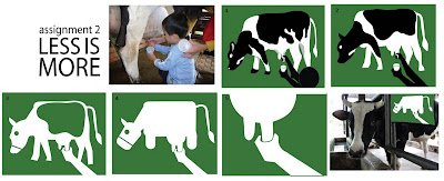
Worked on the idea on of cow milking at an animal farm. Tried out several ways to abstract an idea/design :))
Pic2-->Pic3 - Reduced it complexity. Removed Black. Removed 1 hand.
Pic3-->Pic4 - Less direct representation of the cow at this stage. To fit the idea of a fun animal farm, have made the cow look more "cartoon-like". Exaggerated certain porportions of the cow to bring emphasis.
Pic4-->Pic5 - Zoomed in on the action of cow milking.
Tuesday, February 9, 2010
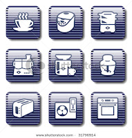
Pictogram Research

Sunday, February 7, 2010
Class Exercise D - Photo Series
– Use your mobile phone, choose a subject and compose it in various shot sizes and camera angles
– State the purposes of using these techniques and how does it affect your audience who perceive your subject.
Left:
- Simple Close-Up. Top-down angle. Bring focus to snail, or more precisely, to the design of the shell. It is complemented by the sharp contour line of the shell brought to the foregound under the lighting effects.
Right:
- Long Shot to give more details on the environment the snail is in.
- Large porportion of the picture taken up by the mosses at the foreground. Coupled with brighter light on the foreground, attention first goes to the mosses before it leads the audience's eyes up to the snail.
- The spread of mosses in the picture suggests a large span of mosses that the snail is in.
- The shot is meant to make the snail appear small and lost amidst the large span of mosses.
- Long shot. Positioned the snail at the left with a large deal of distance in front of it. The shot reinforces the slowness of the snail, appearing only at the "start of the journey".
- Tried the desaturated--> masking effect which I learnt in Chris's tutorial today :) Only the snail in the picture is unsaturated, bringing focus to the snail.
- Top-down shot. Makes the snail appear vulnerable and small.
- The shot taken against the wall, coupled with the shadow, gives a sense of the snail being cornered. Intend to suggest the entrapment of the snail.
Saturday, February 6, 2010
Class Exercise C - Semiotics
Tuesday, February 2, 2010
Assignment 1 - Final
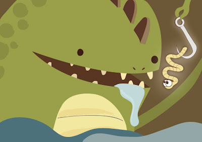
Tada! Final work for Assignment 1 - Me, myself and I! Finally managed to persuade myself to pick this idea out of the two as I thought I like the use of porportion for emphasis and the fun element here.
Further developed the monster to slight 3D to give a sense of depth and changed the look of the worm. Now, it looks so innocently cute! (or as i thought) More importantly, I have tried to give the worm more attention through exaggeration so as to bring focus to what is meant to be my letter M.
Added more details. Changed the color scheme too! Decided to go with cooler colors after experimenting. It better reflects my querky, mysterious nature :))
From the feedback last week, I decided to make the hook and the worm glow so as to bring focus to my name, MJ.
Monday, January 25, 2010
Class Exercise B - Constructive Criticism Model
Analysis – A discussion of HOW things are presented with an emphasis on rela1onships
Interpretaton – A sense of the meaning, implicaton, or effect of the piece
Judgment – Evaluatng the successes and shortcomings of the piece
The picture depicts an “avatarized” figure amidst the jungle. The words, “James Cameron’s Avatar, Only in Cinema”, at the top left, further suggests a reference to the recent hot-selling movie, Avatar, while the McDonalds logo at the top right indicates McDonalds’ involvement in this project.
The focus of the picture lies on the Na’vi character in the foreground, right in the centre, before our eyes are guided to the lighter background with more small details. While it is known that this graphic has most likely been generated from the “avatarize yourself” widget sponsored by McDonalds Europe as part of its marketing campaign, the graphic by itself, standing as an art piece, does not relate to the audience sufficient information on the work. For one who does not know the availability of this McDonalds’ project, he is highly unlikely to decipher the artist’s intention or the intended message of this particular work, though it is not hard for him to point out the main reference to Avatar.
In addition, the graphic is not projected at a suitable resolution, hence resulting in its pixilation.
Friday, January 22, 2010
Assignment 1 - Roughs
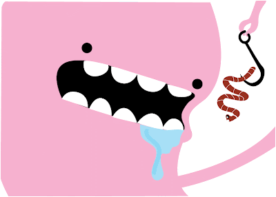
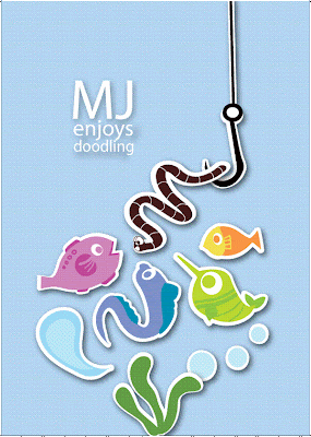
After picking the idea of Worm and Hook, i developed these 2 roughs with rather different concepts.
Monster and Worm: Play around with proportion. Bright colours to establish my cheery and fun nature. Simple doodle style.
Craft, Fish and Worm: Got my inspiration from a recent H1N1 ad by Health Promotion Board. The subjects (eg.fish, worm, hook) in the graphic appears to be popping out like those of a craft work. Graphic composition works more on balance. Colors are less bright compared to the first, but help the subjects to stand out. Like the first, it works on the fun element :))
About NM2208 & Me
Categories
- Assignment 1 (7)
- Assignment 2 (3)
- Assignment 3 (6)
- Assignment 4 (3)
- Assignment 5 (3)
- Final Project (9)


