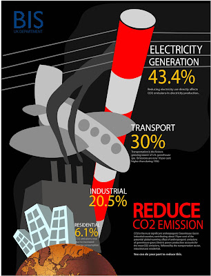
Made quite some edits to the final work - the colors, size, perspective and inclusion of the company's name at the top left to create a sense of balance (i find it too heavy on the bottom right initially)
In response to the feedback for the previous work that the electricity pole does not look like one, I adopted one of their ideas to make it red and white. Now the red seems to flow with my text and add 'loudness' to the piece :) Quite a serendipity.
Made the design more dynamic as well by exaggerating the perspective, making the distance relation more obvious.
No comments:
Post a Comment