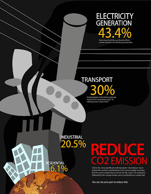
Tata! My first submission for the assignment after much research and multiple attempts. It shows the amount of CO2 emission from different sectors in US and the smaller text shows more detail on the statistic and what the people can do to help.
Tried a few designs which I just feel dissatisfied with. Hence, adjusted along the way before getting this
Following refinement to be done:
- It looks like a plane crash on first sight. So I gonna change the color of the smoke perhaps.
- With feedback from last tutorial, I shall make the smaller-to-larger perspective more significant.
- Gonna change the design for electric pole as it is not easily recognisable.
No comments:
Post a Comment