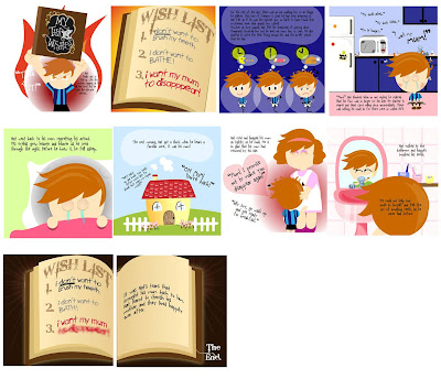
Problems encountered
a. In view that everyone can have their very own designing style, we had taken much time to adjust the colors and frames to make it coherent throughout the book.
b. Our team decided to use Adobe Illustrator due to the need for large number of vector drawings involved. While we often use Adobe Indesign for the designing of publications, this is the first time we use Adobe Illustrator for the design of a book.
Hence, we do not exactly know the requirements or guides required in our story frames for the printer. Our team had to check the different requirements from various printers and worked accordingly.
c. In the search for printers for our storybook, we realized that a good number of printers do not work on hard-cover or perfect binding. Some indicated that the number of pages for the storybook is too insignificant for perfect binding.
d. Our first printing effort was not successful. The printer failed to cut the paper along our specified guides. Hence, there are pages showing incomplete frames or come with white spaces at the bottom of the page. Fortunately, we had sent the book for printing early, thus allowing us to print another book on time for submission.
However, due to the time constraint, the second book comes without a hard cover, which would otherwise requires longer printing time.
Lesson Gained
a. We learnt the importance of time planning and having contingency plan. Fortunately, we had planned for time to allow checking and possible re-print in case of any misprint.
Hence, we were able to find time to work on our second printing after the first attempt which we were not satisfied with.
b. We learnt that when working as a team for design process, it is important for all members to be well-informed of the concept and design decisions in order to ensure the coherence of the storybook.
c. We also now appreciate that the production a storybook takes more than a storyline and a series of illustrations – it requires the synergy of both. Layout, framing, text organization, colors are all part of considerations in order to effectively deliver the story and its message
- Homemain page
- Class Exercisesin lecture
- Assignments1,2,3,4,5
- Researchand findings
- Final Projecthorray
- Galleryview mj's works
Monday, April 12, 2010
Problem in production
For our storybook to show substantial resemblance to the magical book, our team has intended hard cover and perfect-binding for our book, just as we requested for our first printing attempt. However, the printed quality was not within our expectation.
While we went for a second printing attempt, we also considered that hard cover printing will take more time than what we could afford to. Thus we resorted to printing the book at a different printing shop with soft cover in view of the time constraint. However, this is compensated with a quality heavy paper for the cover.
This is a lesson learnt though :)
Storybook Organization Exploration
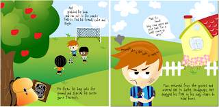
Besides the usual coherent flow, our storybook also explores various representations and framing. This variety helps to break the monotonous one-frame-one-scene style and capture interest of the reader.
For instance, instead of putting the following two scenes as two separate frames, we link them through certain similarity eg. the environment.
In another example, our book takes the form of the magical book in some pages
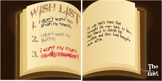
For instance, instead of putting the following two scenes as two separate frames, we link them through certain similarity eg. the environment.

In another example, our book takes the form of the magical book in some pages

Storybook Color Exploration
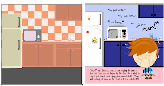
(The above two pictures are of the same composition but explored in different colors)
The final choice of colors is largely vibrant and cartoonish. Some of the main subjects are injected with the sense of 3D through simple shading and choice of color combination.
The sense of depth created also helps to bring forth the foreground and background relation, and aids in directing reader’s focus and flow of view.
The sense of depth created also helps to bring forth the foreground and background relation, and aids in directing reader’s focus and flow of view.
Sunday, April 11, 2010
Assignment 3 - New work, Final Submission
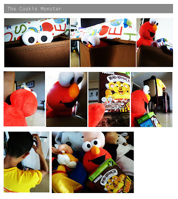
Decided to redo the assignment for submission as I realized that we are graded much on the quality of the photographs as well! I initially thought only the creative element, composition and angle would be graded as that was what we learnt during the week 4 lecture. But well, I had fun doing this again!
The series of photographs share the 'adventure' of the Cookie Monster, who escapes from his toy box to find his cookies (koko krunch here to be exact)!
I thought that taking pictures of still soft toy to tell the story is going to be relatively easier as they are easier to manipulate, I was proven so wrong! Faced so much difficulty along the way to inject life, actions and emotions into the lifeless creature!
The Cookie Monster soft toy was in fact inflexible and standing stiff! So, I had to explore angles and various perspectives to give the illusion that he is walking, climbing, bending and even hugging the box of cookie in the end when it was in fact all along in its upright position with hands wide spread.
Nonetheless, I enjoyed the sense of satisfaction after that though :D
Assignment 3 - Angle and Shot Exploration Part 1
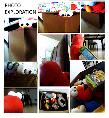
Tried various angles, perspectives and composition along the way in order to find the mood and feel that I wanted to portray.
While I have my storboard as my guide, I also tried other possible ways to present the actions and emotions by the Cookie Monster. For instance, to show him climbing out, i tried shooting him top-down which emphasizes the height and tried shooting bottom-up to highlight his action of climbing out instead.
As the toy is really stiff, I had tried various positions as well to suggest movements. Just for the scene showing him peeking out of the box, I took as many as 20 photos before deciding on which was more effective in conveying the emotion and the story.
Saturday, April 10, 2010
Assignment 3 - Storyboard
Did a fast sketch of the storyboard before shooting. Helped me to pen down some general angles/composition which i have in mind.
Friday, April 9, 2010
Final Project - Exploration
FInal Project - Storyboard
Assignment 5 - Refined for Submission
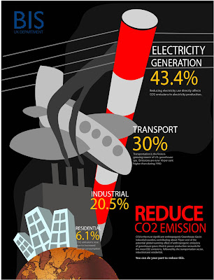
Made quite some edits to the final work - the colors, size, perspective and inclusion of the company's name at the top left to create a sense of balance (i find it too heavy on the bottom right initially)
In response to the feedback for the previous work that the electricity pole does not look like one, I adopted one of their ideas to make it red and white. Now the red seems to flow with my text and add 'loudness' to the piece :) Quite a serendipity.
Made the design more dynamic as well by exaggerating the perspective, making the distance relation more obvious.
Assignment 4 - Refined for Submission
Assignment 2 - Refined before Submission
Assignment 1 - Refined for Submission
Subscribe to:
Comments (Atom)
About NM2208 & Me
MJ's learning journal for academic module NM2208 - Principles of Visual Communication, NUS!
Categories
- Assignment 1 (7)
- Assignment 2 (3)
- Assignment 3 (6)
- Assignment 4 (3)
- Assignment 5 (3)
- Final Project (9)


