Friday, February 26, 2010

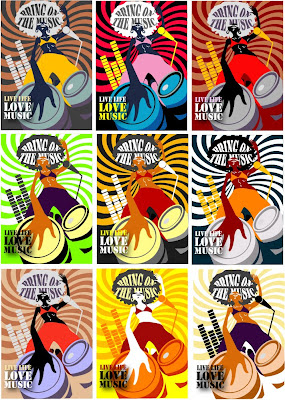
Assignment 4 - Color Coliation Exploration


Was having fun exploring colors and finding colors to suit the mood and theme I would like to bring across :))

Am contemplating between the 1st and the 2nd design. The 1st design works more on harmony - I like the slight pastel feel that is really comfortable and its ability to blend and create depth for the drums. On the other hand, I like the strong contrast in the 2nd picture :))

Tuesday, February 23, 2010

Assignment 3 - Angle and Shot Exploration


One of the parts which i spent most time developing and experimenting is the slamming of the book. Tried various shots and positions to find out how to best suggest movement in action.

Assignment 3 - U C What I C


Class Exercise E

Size: A6 (per image)
• Pick 2 words from the list
• Use basic elements (dot, line, shape…) to create 2 abstract / semi‐abstract images conveying
meaning of these words (1 image per word)
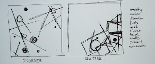

I have picked disorder and clutter. Quite a fun challenge to pick these two as they seem close. So, i decided to try how I can differentiate one from the other. Mainly made use of shapes, lines and dots.

Disorder: It is slightly heavier on the top (with more subjects) to reinforce the sense of unbalance and disorder. Tried to inject different thickness and sizes to help create the sense of disorder. However, frankly, it doesn't look disorder enough for me, perhaps to the pattern that it seems to hold.

Clutter:
Made it heavy and squeezy on one corner to bring across the feel of being cluttered. The overlapping of shapes and lines helps to reinforce the idea of clutter.
Thursday, February 11, 2010

Assignment 2 - Less is More


PROCESS OF ABSTRACTION
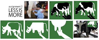
Worked on the idea on of cow milking at an animal farm. Tried out several ways to abstract an idea/design :))

Photo-->Pic1

Pic1-->Pic2 -Took off the 3D effect by removing the shadow. Made the cow spots less defined. Removed the head of the man to bring focus on the act of milking instead.

Pic2-->Pic3 -
Reduced it complexity. Removed Black. Removed 1 hand.

Pic3-->Pic4 - Less direct representation of the cow at this stage. To fit the idea of a fun animal farm, have made the cow look more "cartoon-like". Exaggerated certain porportions of the cow to bring emphasis.

Pic4-->Pic5 - Zoomed in on the action of cow milking.

Tuesday, February 9, 2010

Pictogram Research


Pictures from: http://www.shutterstock.com/pic-20475776/stock-vector-color-set.html

Was doing my research for my pictogram assignment when I came across this. Isn't it interesting how the same set of pictogram can be designed to bring different effects, themes and mood through the change of its colors, form and lines?

My decision to make my pictogram series set against green background was partly inspired by this :))

Sunday, February 7, 2010

Class Exercise D - Photo Series

Making photo compositons
– Use your mobile phone, choose a subject and compose it in various shot sizes and camera angles
– State the purposes of using these techniques and how does it affect your audience who perceive your subject.


Left:

  • Simple Close-Up. Top-down angle. Bring focus to snail, or more precisely, to the design of the shell. It is complemented by the sharp contour line of the shell brought to the foregound under the lighting effects.

Right:

  • Long Shot to give more details on the environment the snail is in.
  • Large porportion of the picture taken up by the mosses at the foreground. Coupled with brighter light on the foreground, attention first goes to the mosses before it leads the audience's eyes up to the snail.
  • The spread of mosses in the picture suggests a large span of mosses that the snail is in.
  • The shot is meant to make the snail appear small and lost amidst the large span of mosses.

  • Long shot. Positioned the snail at the left with a large deal of distance in front of it. The shot reinforces the slowness of the snail, appearing only at the "start of the journey".
  • Tried the desaturated--> masking effect which I learnt in Chris's tutorial today :) Only the snail in the picture is unsaturated, bringing focus to the snail.

  • Top-down shot. Makes the snail appear vulnerable and small.
  • The shot taken against the wall, coupled with the shadow, gives a sense of the snail being cornered. Intend to suggest the entrapment of the snail.

      Saturday, February 6, 2010

      Class Exercise C - Semiotics


      For Class Exercise C, we are to draw iconic and indexic representation of an object.
      Jessie, chloe and I decided upon CAR.

      We explored on drawing/suggesting CAR through the outline of the car body, moving wheels, steering wheel, driver with seatbelt, and even car from computer game.

      Tuesday, February 2, 2010

      Assignment 1 - Final


      Tada! Final work for Assignment 1 - Me, myself and I! Finally managed to persuade myself to pick this idea out of the two as I thought I like the use of porportion for emphasis and the fun element here.

      Further developed the monster to slight 3D to give a sense of depth and changed the look of the worm. Now, it looks so innocently cute! (or as i thought) More importantly, I have tried to give the worm more attention through exaggeration so as to bring focus to what is meant to be my letter M.

      Added more details. Changed the color scheme too! Decided to go with cooler colors after experimenting. It better reflects my querky, mysterious nature :))

      From the feedback last week, I decided to make the hook and the worm glow so as to bring focus to my name, MJ.

      Assignment 1 - More Exploration


      Further exploration after 1st critique lesson. Here, i am trying out the idea of "craft work" working on the same idea of worm and hook :))