Monday, January 25, 2010

Class Exercise B - Constructive Criticism Model

Descripton – A verbal account of WHAT is there
Analysis – A discussion of HOW things are presented with an emphasis on rela1onships
Interpretaton – A sense of the meaning, implicaton, or effect of the piece
Judgment – Evaluatng the successes and shortcomings of the piece


Picture from NM2208 Lecture

The picture depicts an “avatarized” figure amidst the jungle. The words, “James Cameron’s Avatar, Only in Cinema”, at the top left, further suggests a reference to the recent hot-selling movie, Avatar, while the McDonalds logo at the top right indicates McDonalds’ involvement in this project.

The focus of the picture lies on the Na’vi character in the foreground, right in the centre, before our eyes are guided to the lighter background with more small details. While it is known that this graphic has most likely been generated from the “avatarize yourself” widget sponsored by McDonalds Europe as part of its marketing campaign, the graphic by itself, standing as an art piece, does not relate to the audience sufficient information on the work. For one who does not know the availability of this McDonalds’ project, he is highly unlikely to decipher the artist’s intention or the intended message of this particular work, though it is not hard for him to point out the main reference to Avatar.

In addition, the graphic is not projected at a suitable resolution, hence resulting in its pixilation.


Friday, January 22, 2010

Assignment 1 - Roughs


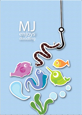
After picking the idea of Worm and Hook, i developed these 2 roughs with rather different concepts.

Monster and Worm: Play around with proportion. Bright colours to establish my cheery and fun nature. Simple doodle style.

Craft, Fish and Worm: Got my inspiration from a recent H1N1 ad by Health Promotion Board. The subjects (eg.fish, worm, hook) in the graphic appears to be popping out like those of a craft work. Graphic composition works more on balance. Colors are less bright compared to the first, but help the subjects to stand out. Like the first, it works on the fun element :))

Assignment 1 - Preliminary Sketches

These are some sketches which i further developed from my thumbnail doodling. I have fished these ideas out from the thumbnails as I see them as more interesting and having greater potential to be developed. Moreover, I think they say more of me.

Try spotting my name: MJ/MINJIA among the works! :)


Theatre: I used to study theatre, and I still think theatre is an interesting field to explore in the Arts.
Playground: Reflects my playful and fun-loving nature :)


Music: I enjoy listening to music! Made this design more dynamic.
Forest: I love trees. Quite an environmentalist. Advocates recycling and against wasting of paper. While everyone is trying to put their names into objects, i decided to try the reverse - create my name through the absence of objects.


Food: I enjoy food! Who doesn't!
Fish & Worm: I like the querky and fun nature of this design, which reflects my character.

Assignment 1 Research


http://www.flickr.com/photos/zeusmb/
http://crymz.deviantart.com/art/Experimental-Typography-Candy-142091911
http://www.apartmenttherapy.com/sf/inspiration-book-typography-084930

While i was searching for more ideas and inspiration for "Me, Myself and I". I came across these interesting designs online.

I like particularly the last one, which hides the message " A Shut Book is Just a Block" by the clever use of colors.
Employed some of these ideas in my brainstorming thumbnails as well :))

Class Exercise B, Assignment 1

"ME, MYSELF & I" BRAINSTORM + THUMBNAILS

TITLE
Me, Myself and I

TASK
Create 1 design based on the letters of my name/initial/nick name. USe these letters to interpret myself through manipulation of letters, use of symbols, shapes and colors i.e.visual form

NOTE
Letters must be readable, integrated sufficiently. NOT an exercise for typography!


BRAINSTORMING IN PROCESS
-scribbling down words which relate to me

THUMBNAIL SKETCHES
-fast doodling of ideas after brainstorming
-I mainly worked on my initial "MJ", which people usually know me for :)

Sunday, January 17, 2010

Class Exercise A

Sketch (Design) a machine/device that enhances your creativity 100 times

SENSORY CAPSULE
Concept: It works much like a high-technology simulator which involves the triggering of all you 5 senses when you lie in it. The idea of inducing senses and using simulated experience to increase creativity in fact rooted from my usual creative and design process. Yes, I realize that my creativity is highly linked to my inspirations and personal experiences - the sources of my creativity juices.

however, sadly, I, too, realize that we face limitations and restrictions as humans and hence we do not all have the chance to experience what each other individual might have. This SENSORY CAPSULE will help to compensate for that by providing these hard-to-come-by experience and put our senses to test. I believe these inspiring and life-like experiences will strongly trigger my inspiration and creativity at much ease and comfort.

Features:
SETTING PANEL: Users can set the experience and environment which they would like to be expose to. They can even choose the sense(s) which they would like to focus more on.

ALL-AROUND SCREEN: Each inch of the inner layer of the capsule is in fact a part of the screen. User will find themselves enveloped by the simulated environment as contributed by the all-around screen.